
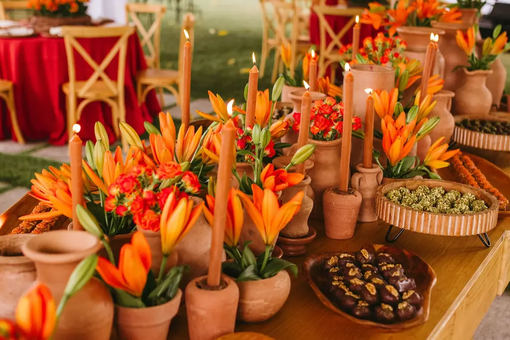
Some colour palettes come off a paint chart. This one comes off the sky over the Atlantic at a little after seven on a mid-March evening, and honestly? We have not stopped thinking about it since.
Terracotta, peach, apricot and that dusty lilac the sky goes once the sun has dipped: it is warm, it is grown-up, and it flatters just about everyone in the photographs. Best of all, it is the palette South Africa practically grows for you. Pincushions, leucadendrons and restios already come in these shades, so your florist is not fighting the season to get there.
So here is our working guide to the sunset wedding colour palette: five combinations with hex codes you can hand straight to your stationer, which local flowers deliver each shade and when, and the handful of things that make it look like a sunset rather than a pumpkin patch.
Five sunset palettes, with the hex codes
Each palette runs from the boldest shade to the quietest.
- Golden Hour Classic — terracotta
#B85C38, peach#F2B199, warm sand#E9D8C0, sage#9CA88A. The safe, gorgeous default. Sage keeps it fresh rather than heavy, and it suits a Winelands barn as happily as a garden. - Fynbos Sunset — pincushion orange
#E8762B, leucadendron red#8E2B26, protea blush#F2C4B5, restio bronze#8A6A3B. The most South African of the five, and the one that photographs with the most punch. - Karoo Dusk — burnt clay
#A8553A, dusty peach#E7B8A0, twilight lilac#9C93A8, charcoal#3D3B40. The ten minutes after sunset. Lilac and charcoal cool the warm shades down, which makes this the one for an evening reception. - Coastal Peach — coral
#E9806E, soft peach#F6C1A0, driftwood#B49C83, salt white#F7F3EE. Lighter and breezier, for a beach or seaside ceremony where heavy terracotta would feel like too much. - Rust + Ink — ink navy
#1F2A44, rust#A65A2E, apricot#F0A868, brass#B08D57. Navy gives the warm shades something to glow against. Lovely for suits and for an April evening.
A useful rule of thumb: let the quiet shade cover most of the room (linen, paper, walls), give the mid-tone the flowers and the bridal party, and keep the boldest shade to small hits. Orange everywhere stops reading as sunset very quickly.
The South African flowers that deliver it, and when
This is where a South African couple has an unfair advantage. Seasons below are from the South African National Biodiversity Institute (SANBI) unless we say otherwise. Cultivated stems can stretch these windows, so treat them as a guide and ask your florist what is cutting well in your month.
- Pincushions (Leucospermum cordifolium) — the orange and coral fireworks. SANBI describes them flowering at Kirstenbosch from the middle of July to the end of November, and calls them a much-used cut flower. They are your headline bloom for a September, October or November wedding. Do not build a March wedding around them.
- King protea (Protea cynaroides) — SANBI lists its flowering season as sporadic, more or less all year, with bracts from creamy white to deep crimson. The soft pale-pink forms sit beautifully beside peach. One per bouquet is plenty. For a rand anchor on proteas generally, Protea Groves, a Pretoria grower, sells six proteas (variety not named) with fynbos for R350, no vase (checked November 2026; one grower, not a market rate).
- Leucadendron ‘Safari Sunset’ — the name gives it away. SANBI describes this hybrid producing large deep-red bracts on long stems from autumn through to late spring. It is your deep-red anchor for an April wedding and the reason Fynbos Sunset still works in autumn, long after the pincushions have finished.
- Restios (for example Elegia capensis) — the reedy texture that stops an arrangement looking generic. SANBI notes that its golden-brown, later dark-brown flower heads are decorative from about September to February, and that the young stems are used in flower arranging. That is restio bronze, straight off the plant.
- Barberton daisy (Gerbera jamesonii) — the Highveld’s answer. It grows wild in grassland in Mpumalanga, Gauteng and Limpopo, in cream, red, orange or pink, flowering in spring to early summer and again in autumn. It is also one of the parents of the commercially grown florist gerberas, a handy option away from the Cape.
Put together, the calendar looks like this. Spring (September to November) is pincushion season, so go bold! Midsummer (December to February) leans on restios, whatever proteas are cutting well and plenty of terracotta pottery doing the colour work. Late summer into autumn (March and April) belongs to ‘Safari Sunset’ and gerberas. For the full cast list and how to keep protea leaves from blackening, our protea and fynbos bouquet guide has you covered.
How the palette behaves in South African light
A sunset palette is, quite literally, designed for the last hour of daylight, so it pays to know when that hour is. Sunset times for the 15th of the month, in SAST:
- Cape Town — October 18:59, December 19:53, March 19:05, April 18:23.
- Johannesburg — October 18:14, December 18:56, March 18:24, April 17:52.
Look at the gap. A Cape Town couple in December has golden light until close to eight in the evening, while a Johannesburg couple by mid-April has lost the sun before six. Golden-hour portraits start about an hour before sunset, so look up the time for your actual date and build the day around it. Our golden hour and blue hour timeline does the arithmetic properly.
- Test peach in hard light. Pale peach can bleach towards cream under flat overhead sun. Photograph your fabric swatch on your phone outside at midday, then again an hour before sunset. If it vanishes at noon, choose a deeper apricot or move the portraits later.
- Know whether you mean terracotta or rust. Terracotta leans pink and clay; rust leans orange-brown. Warm evening light tends to push both warmer, so a terracotta that looks perfect at noon can tip orange at golden hour. Ask your photographer for a full gallery shot in similar light, not a single hero image.
- Watch the afternoon heat. A late-afternoon ceremony in midsummer can still be hot for guests sitting in the sun. Our summer heat plan covers the timing and the shade.
Attire, stationery and the table
- Bridesmaids in two or three shades, not one. Peach, apricot and dusty clay side by side look deliberate, and everyone gets the shade that suits her.
- Ivory rather than stark white for the dress. Bright white can look harsh beside peach in warm light.
- Suits in sand, stone or navy with a terracotta tie or pocket square. Navy is where the Rust + Ink palette really earns its place.
- Paper with some texture. Cream or handmade stock, terracotta ink and one illustrated pincushion or protea. Print the sunset time on the order of the day so your MC and photographer are working to the same clock.
- Unglazed terracotta on the table. Pots, bud vases and taper candles in the palette, sand-coloured linen and peach napkins. Mix in brass and the table glows once the candles are lit.
The pitfalls, briefly
- Promising flowers out of season. A March mood board full of pincushions is a conversation you want to have with your florist now, not in February.
- Matching everything exactly. Five shades of one orange look flat. A sunset is a gradient, so let the colours drift.
- Trusting your screen. The same hex code prints differently on linen, card and silk. Get physical samples of everything.
- Picking from the veld. The pincushions on the mountainside belong to the sugarbirds. Buy cultivated stems from a florist or grower.
One last thing
Before you lock in the palette, go and stand at your venue at the time of your ceremony, swatches in hand, in the same month as your date. Watch what the light does to them over half an hour. It is the quickest way to find out whether your peach glows or disappears, and it costs you nothing but an afternoon.
Save this post to a Pinterest board before your florist meeting, so the hex codes go with you. Then follow Celebration on Pinterest if terracotta and peach have stolen your heart too.